If your brand is looking to make a change to its current identity, the options can be overwhelming.
When you launch a new brand, the decision is easy. Starting from scratch to develop a color palette, type style, and identity for your company is a no-brainer; you’re laying the foundation to build something exciting from the ground-up. However, that changes when you’re thinking about altering your identity after you have brand equity and a customer following.
Both a brand refresh and a rebrand involve adjusting some amount of your current identity. This means changes to your logo, brand extension, website, social media presence, packaging, and sometimes even culture and operations.
A brand may choose to undergo either of these for a variety of reasons:
- The logo is starting to feel outdated.
- Your company has pivoted and the logo is too specific, reflecting a past goal.
- The design was created before the company really knew who its target audience was.
- An investor is requiring one as part of a new contract.
- A merger or new partnership has occurred.
- The original design was created without strategy or at a high level of execution to accommodate a low budget or out of necessity.
- After a bad PR incident, you may need to shake an old identity to continue forward.
- If your company has had considerable success and growth, a rebrand is a great opportunity to develop brand consistency with an existing or new graphic kit of parts.
- A new CEO or marketing department has become part of your team.
The difference between a refresh and a rebrand lies in how big these changes are, and what affects they will have on your audience.
Rebrand
A rebrand is a complete overhaul of a company’s identity. It will often keep very little of the original elements of the logo, colors, personality, etc, and aims to alter how the brand is perceived. This can be a good idea if a company changes names, is looking to reach an entirely new audience, or just doesn’t feel like their current design “fits” what they do (or want to start doing) anymore.

If your company relies heavily on an identifiable aesthetic to drive sales, a refresh might better serve your mission. If you’re truly looking to revamp what already exists within your company, then a full rebrand may be the way to go. Sometimes these changes will start at a foundational level, and a company will need to reexamine their strategy and goals. If these aspects of a brand are already working, a purely-aesthetic overhaul will help reflect your values through design.
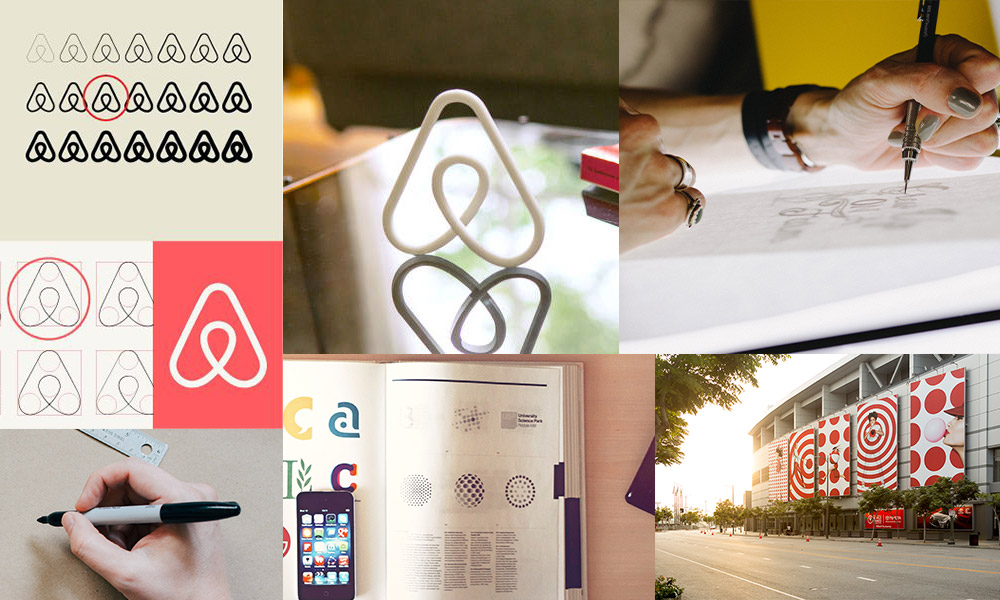
One company that benefited greatly from a rebrand is Airbnb. Previously, they had a complex, loud logotype that was hard to read at small sizes. After rebranding, the company became a modern, friendly platform that felt trustworthy.
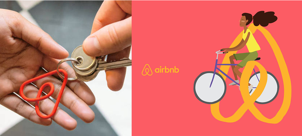
It transformed how the company is perceived by the public in a way that promotes their business. Did some joke about the new look when it first launched? Sure. But sometimes that’s a key indicator that people have taken notice, and that the updated look has made an impact on more than just their target audience.
If these kinds of changes seem too drastic for your company, a refresh might be the way to go.
Brand Refresh
A brand refresh updates an already-existing identity. It generally reflects the same values, and retains what already has brand equity, while allowing the identity to stay easily recognizable. This might be achieved through changing the color palette, while using the same typeface; or adjusting the logo to better reflect the attitude of what the company has become.
A brand refresh has a lot of options. This is because there are so many things that can be tweaked while staying within the general realm of the existing design. Sometimes it’s as simple as refining a logotype; or changing colors to brighter and bolder hue
Target is a perfect example of a successful brand refresh evolution. The target icon became widely recognizable because it stayed consistent across every iteration of their logo. Because of this, they dropped the typography completely and let the icon shine.
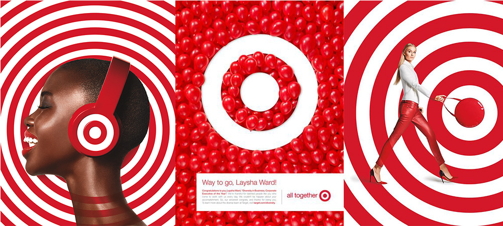
Due to the brand equity they have built, Target was able to eliminate unnecessary words from the main logo, the overall identity of Target became simpler, and in return, more modern. This helped solidify their position in the market while evolving to reflect what resonates visually with current audiences. Through a rebrand, they were able to do all this and keep the key elements that worked about their identity.
There are multiple considerations when contemplating changes to your brand. But coming out the other side with a design your team and audience loves, and a new outlook on what your business is extremely rewarding.
When in doubt, don’t be afraid to shake things up, you never know what new doors a new look can open.